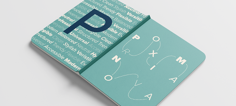
Proxima Nova
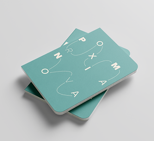
Mini Zine
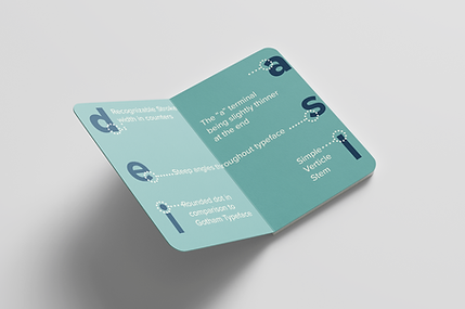
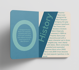
This project gave me the opportunity to explore the typeface Proxima Nova, focusing on its characteristics, versatility, and background. I presented the information in the form of a small booklet, designing it on a single sheet that folds into a compact format. This allowed me to thoughtfully organize the content while also experimenting with layout and composition.
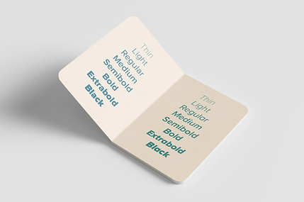
Proxima Nova is a clean, modern typeface with a balance of geometric and humanist qualities, which influenced my design choices throughout the booklet. I focused on creating a layout that felt structured but still visually engaging through hierarchy, spacing, and color. This project pushed me to be more intentional with my design decisions and explore a more refined, balanced style while still keeping it true to my approach.

The Process:
I started by creating thumbnail sketches to explore different layouts and ideas. This step helps me get all of my ideas out quickly and piece them together, allowing me to see what works best before moving into the final design.


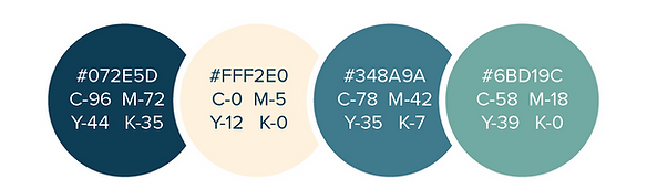
Color Palette:
The palette blends light, airy tones with a deeper contrast to create a sense of balance and structure. It supports the layout while keeping the overall design soft and visually engaging.
The Zine: